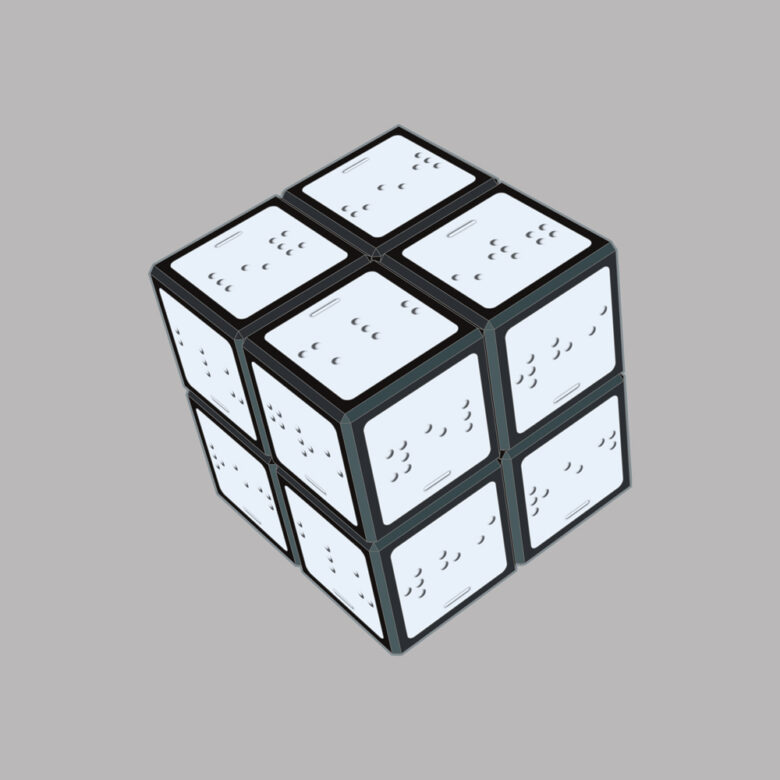
The Designing Accessible Learning Content cubes. You might be wondering what relevance these cubes have to working with the accessibility constraints of eLearning authoring tools. Have a guess and then read on to find out if you were right.)
In my previous blog, I wrote about how transforming my book Designing Accessible Learning Content into an online self-access programme, was providing me with a great opportunity to really get to grips with some of the complexities of making learning content accessible first-hand. Undoubtedly one of the biggest challenges I’ve faced is figuring out how to work with the accessibility constraints of the authoring tool I’m using, and yet still make the content as accessible as possible. I know it’s an issue that many learning practitioners struggle with, because requests for tool recommendations and questions about tool limitations are probably the things I’m asked about most often on webinars and podcasts.
My answer to these questions is always the same. Although there’s been a definite improvement in the accessibility capabilities of modern authoring tools over the last few years, I don’t believe there is one tool that ticks every box when it comes to creating fully accessible learning content. And even if there were such a tool, it’s still possible for content creators to develop inaccessible content if they don’t understand the many barriers that can prevent people with access needs from having an equal learning experience. That’s why our focus at eLaHub is on training and empowering people to understand the principles of accessibility and how to apply them using a range of different authoring tools.
So how can practitioners work within the accessibility constraints of their tool, and yet still make their content accessible and inclusive? Here are the two most important things I’ve learnt as I’ve been designing and developing the Designing Accessible Learning Content Programme.
1. Know your tool
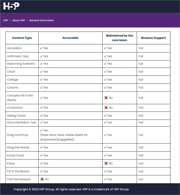
Find out about the accessibility functionality and limitations of your authoring tool. Ideally you’ll be able to find a Web Content Accessibility Guideline (WCAG) conformance report, a Voluntary Product Accessibility Template (VPAT) or other information which will tell you which interactive content types are accessible. Be careful, however, not to make assumptions. For example, with many tools drag and drop interactivities are not accessible for people with vision and motor access needs. Yet, with other tools, this content type has been made accessible. So make sure you are 100% confident about which interactive content types are and aren’t accessible with your tool.

2. Decide on your tool accessibility limitation strategy
Once you know which interactivity has accessibility issues, the next question to address is how you are going to deal with this. Do you decide to exclude all interactions which are not accessible to everyone, or do you decide to include inaccessible interactions but provide an alternative? This is by no means a clear-cut decision. We’ve worked with clients that strictly follow the first approach. This is sometimes the case with organisations that are bound by stricter requirements to meet accessibility legislation, or sometimes because they believe that providing alternatives in any form is not in the spirit of providing an equal experience for everyone. Other organisations believe that providing alternative ways of accessing content is the best option, because it makes the learning more adaptable to a range of access needs, learner circumstances and preferences.
Working on this programme has given me the chance to gain greater clarity on what I think is the most effective way to address this issue. And I believe that in the interest of creating an effective learning experience for everyone, it is better to use inaccessible interactivities and supplement these with accessible alternatives, rather than avoiding them altogether. To explain why this is, I’ve developed the Designing Accessible Learning Content (DALC) cubes. Now’s your chance to check if you were right about what the cubes mean.
1. Interactive but inaccessible learning content
The first DALC cube represents learning which is interactive and engaging, but which isn’t accessible – in this case – to someone who has vision access needs. The brightly coloured squares on the puzzle, can’t be seen by someone who is blind, so the experience is inaccessible.

2. Accessible but compromised learning content
This second DALC cube represents the danger of what can happen to a learning experience if we strip out all interactivity unless it is entirely accessible. The colours in the squares have been replaced with braille lables so that the interactivity is accessible. But, because all of the colours have been replaced by white squares, this has compromised the learning experience for everyone else.

3. Interactive and accessible learning content
The third cube is my representation of what happens if inaccessible interactive content types are supplemented with accessible alternatives. Just like this DALC cube with colour and texture, it caters for a wider audience and provides a richer learning experience for everyone.

Case study
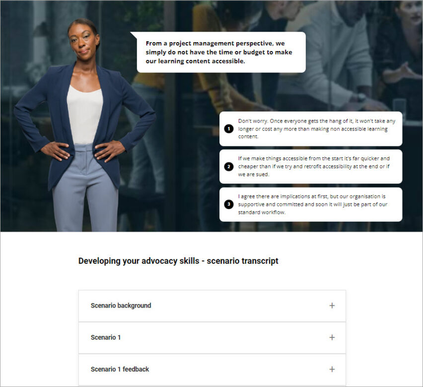
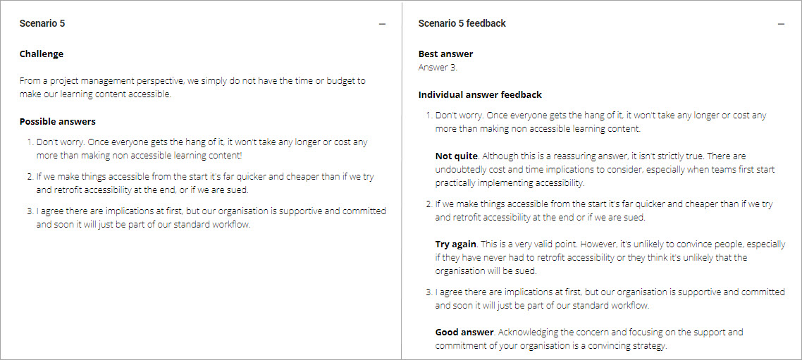
I know from the conformance report of the authoring tool I’ve used to create the Designing Accessible Learning Content Programme, that the scenario interactivity is not fully accessible due to issues with alternative text. In addition, I’ve carried out testing of the interactivity with someone who uses a keyboard instead of a mouse and they found it difficult to navigate. I’ll also never forget the feedback I once had from a learner who told me on their course evaluation that they ‘loathed and detested’ scenarios. But, as an instructional designer, I think a scenario activity, if used well, can be a very effective way of giving feedback and encouraging behaviour change.
I therefore use the interactivity:

But I also provide an alternative in a way that still gives learners the opportunity to reflect and consider before I give the suggested correct answer and feedback:

You can find many more examples of this approach in the full eLaHub Designing Accessible Learning Content Programme which is set to launch in the Autumn. In the meantime you can see it in practice in the Taster module we are releasing to celebrate Global Accessibility Awareness Day (GAAD) on 18th May 2023.
Use the link below to sign up and unlock the 7 free showcase lessons in the taster module. If you complete the module you’ll get a digital badge and the opportunity to give us some feedback on what you think. I know not everyone will agree with our approach, so I’d love to find out your thoughts. We’re offering free access to the full programme when it’s released for the most helpful feedback we receive.
Sign up for the Designing Accessible Learning Content Programme taster module


Recent Comments