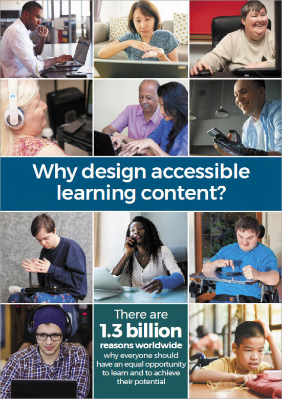
eLaHub’s many online webinars and face to face sessions are supported by our Why design accessible learning content? leaflet. It makes the case that there are 1.3 billion disabled people worldwide who benefit from equal access to learning content – and that’s just people with permanent disabilities. This number doesn’t include the many millions more who are affected by temporary and situational access needs which makes accessible learning content just as beneficial.
We wanted everyone to have access to the tips and useful links from this leaflet, so have provided an online version below. We’ve also added an accessible PDF version of the leaflet that you can download.
Get started now!
Vision access needs

- Make sure there is good colour contrast between text and background colours.
- Add alternative text to all images which add meaning and make sure images which don’t add meaning aren’t announced by assistive technology.
- Use heading styles so screen reader users can easily understand the structure of the learning and navigate.
- Do not convey meaning using colour alone (e.g. green for correct and red for incorrect).
- Provide audio description or descriptive transcripts for videos with important visual content.
Hearing access needs
- Provide synchronised, descriptive and accurate captions for video content.
- Provide transcripts for audio and video content.
- Avoid audio-only instructions or warnings (e.g. a warning sound if learners make a mistake).
- Allow learners to control the audio volume.
- Avoid background audio behind speech in audio tracks unless it is quiet enough not to cause distraction or learners can switch it off.
Motor access needs

- Make sure that learners can use all the functionality of the learning resource with a keyboard.
- Make sure there is a clear ‘visible focus indicator’ to show when interactive items have been selected with a keyboard.
- Avoid interactions which rely on the use of a mouse such as ‘drag and drop’ interactions.
- Use clear and consistent navigation.
- Use inclusive instructions, (e.g. select instead of click, enter instead of type etc.)
Cognitive access needs
- Allow learners to control any time limits – or do not set them.
- Allow learners to pause, stop or hide any moving elements in the learning resource.
- Use the clearest and simplest language appropriate for the context and audience.
- Do not include any content which flashes more than three times per second.
- Provide transcripts for audio and video content.
Useful links (all open in a new tab)
Web Content Accessibility Guidelines
WebAIM colour contrast checker
UK Home Office accessibility posters
Designing Accessible Learning Content by Susi Miller
(20% discount with code AHR20)
LinkedIn eLearning accessibility community
Accessible PDF
Download an accessible PDF version of the leaflet to share and help spread the word!
Many thanks to our creative partners Thomas Miller for ensuring that our PDF version, created using Adobe InDesign, is fully accessible!
The Desgining Accessible Learning Content Programme
You can find out more about making your learning content fully accessible to the latest accessibility standards by taking part in the eLaHub Designing Accessible Learning Content Programme. This fully self-access on demand programme is available to buy now.


Recent Comments